The One Time I Love Cluttered PowerPoint Slides
Clutter: To fill or cover with scattered or disordered things that impede movement or reduce effectiveness.
Disordered. Impede. Reduce. With a definition like that—provided in this case by Merriam-Webster—it’s no wonder our culture views clutter with contempt.
A person with a cluttered mind is intellectually suspect. A person with a cluttered apartment is targeted by professional closet organizers. A person with an unusual amount of clutter might be featured on “Hoarders.”
When it comes to PowerPoint design, virtually every expert advocates simplicity and the generous use of white space. It’s good advice. Most of the time. But there’s one time I love clutter on a slide.

Clutter—in this case defined as a busy slide with so much text or so many graphics as to render the slide unreadable—can communicate something powerful.
As examples:
Imagine you’re leading a sales pitch to a group of potential investors and want to convey just how many clients have already signed on with your company. Listing the companies in 8-point font, as the above slide illustrates, makes clear that you have a lot of clients—and probably has more impact than simply saying, “300 brands have already signed a contract with us.”
Imagine you’ve convened a meeting and gotten dozens of major organizations to participate. Showing a “busy” slide bursting with their logos can help elicit a “Wow!” response.
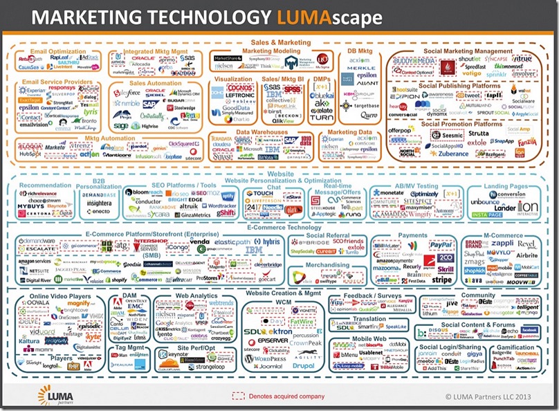
Imagine you’re speaking to a group of chief technology officers about the number of platforms your company can manage for them. Saying “hundreds” may not mean as much as flashing this slide up for just a few moments. (I found this slide online; it’s from a company called Luma Partners.)

The key to making this device work is to marry the visual with your narration. When showing a slide that features the logos of the dozens of organizations you’ve convened, for example, you might say:
“I know you can’t see each of the individual logos on the slide behind me, and that’s because so many more groups than we ever could have imagined decided to join our cause. The fact that no single logo stands out is significant. It represents the selflessness each of these groups has exhibited, with none wanting to take more credit than the others.”
This technique is unexpected, which helps to grab people’s attention. When deployed skillfully, it can have more impact than words alone ever could.


