A Client Challenges Me: You Can’t Make This Slide Better
During a recent presentation training workshop, I discussed the best practices for PowerPoint design.
As usual, I made the case that words and bullets are ineffective mechanisms through which to transfer knowledge to an audience. Instead, I told the audience, well-designed visuals do more to make your points memorable than bullet points ever could.
To reinforce my point, I showed several examples of my “before and after” slides. (Those slides are proprietary, but these sample slides will give you a good idea of the approach I take.)
After making my impassioned case for cleaner slides, one woman in the audience—a lawyer who lectures about copyright law—raised her hand. She said, “I like what your slides look like, but there’s just no way we can do that here. Our content doesn’t work for those types of visual slides.”
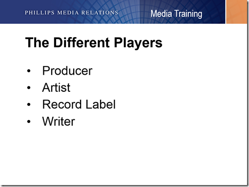
I noticed that she had a rather large printout of her slides in front of her, so I asked her to flip to any random slide in her deck. She turned to a page that looked like this:
“See what I mean?” she said. “There’s not a creative way to do that.”
I asked her to tell me what point she wanted to make while showing that slide. “I want people to realize that those are four different things—and that obtaining legal clearance from only one of those parties may not be sufficient.”
I asked the audience to give me a moment to try to come up with something better. For the first several seconds of silence, I’ll admit that I was stumped—and as the seconds ticked away, I got increasingly nervous that I’d have to concede defeat.
Suddenly, I had an idea. I whipped out my iPhone and did a quick Google search. I got the facts I needed, turned back to the audience, and announced:
“The best slide you could show to make this point is to show no slide at all!”
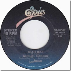
Then, I pressed play on the song I had queued up on my phone, Michael Jackson’s Billie Jean. The audience looked a bit confused as the song’s opening bass line kicked in, but I had their attention. Then, I said:
“Michael Jackson wrote and performed this song. But he didn’t produce it. Quincy Jones was the producer of this track. And Epic Records, a division of Sony, is the record label. If you want to use this song and think that all you’d have to do is clear it with Michael Jackson—or, in this case, his estate—you could set yourself up for serious legal risk.”
Without much prompting, she agreed that would be a much more effective approach. And it didn’t require a single bullet point.
If she had still wanted to use a slide, she could have shown a full-screen still from the Billie Jean video, an image of the 45 (remember those?), or just a shot of Michael Jackson. She could have embedded the audio into the slide, pressed play, and allowed the audience to wonder what her point was for a few seconds before delivering it.
With enough thought, there is almost always a better way to make your on-message visuals more memorable. And sometimes, you might find that your creative thought eliminates the need for a slide altogether.
Don’t miss a thing! Click here to instantly join our mailing list and receive the best of the blog twice each month.


Your version would have been very effective, Brad. And probably very impractical (or at the least expensive). If she was making the presentation for commercial or public use, she would have needed to clear rights for use of Billie Jean. And as the entire point of the slide demonstrates, that can be tricky.
As we all know, in most cases, these kinds of things are overlooked and don’t create real problems for the majority of casual users. But when you are a law firm giving a talk about the legal specifics of copyright and use clearance, you kind of have to play by those rules!
Using popular music in formal presentations is a minefield. I try to stay away from it (although I would love to get the rights to use “Green Onions”… The best underlying instrumental track I have ever found for laying underneath spoken narration).
Your point stands however… Almost ANYTHING is better than standalone text bullets on a slide! 🙂
Hi Ken,
Thanks for your smart comment.
The alternatives I offered toward the end of the post (showing the 45 sleeve of Billie Jean, a public domain photo of Michael Jackson, etc.) would work well without the song snippet.
As for copyright, I think you hit the hammer on the head when you wrote, “these kinds of things are overlooked and don’t create real problems for the majority of casual users.” I’ve never heard of a case in which playing a 15-second snippet of a song to make an editorial point during a small, unrecorded business meeting led to a lawsuit. But you’re right that it’s worth educating readers about the requirements so they can make those decisions for themselves.
ASCAP’s licensing requirements are here: http://www.ascap.com/licensing/licensingfaq.aspx#general. BMI, the other major licensing agency, has its requirements here: http://www.bmi.com/licensing/entry/business_using_music_bmi_and_performing_rights.
Regardless of the decisions individual speakers make, there are some obviously safe choices people should make. I’d always stay away from unlicensed copyrighted music during large gatherings and conferences, during recurring presentations, and during any talks that are recorded for online or on-air playback.
Thanks for commenting,
Brad