The Right PowerPoint Slide Makes All The Difference
I recently worked with a speaker who wanted his audience to know what a vast difference 34 percent made in terms of success vs. failure.
That percentage, he had calculated, was the precise difference between salespersons who were consistently at the top of his company’s sales rankings and those who were failing in their jobs. The problem he faced is that much of the sales force didn’t agree that 34 percent was a massive number. Yes, it could be the difference between $10,000 and $6,600 in monthly salary – but many of the people at the lower range were satisfied with their pay.
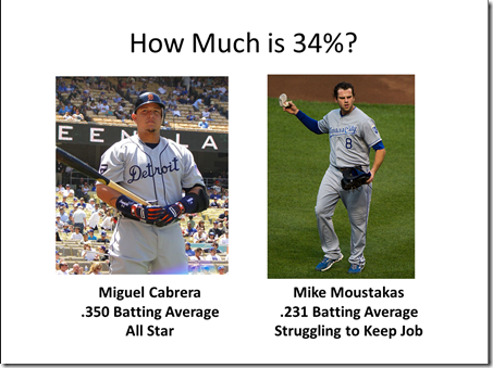
Before we spoke, he had prepared a PowerPoint slide to make his point. Here’s what it looked like:
Now, that slide might make an impact if his audience was composed of baseball talent scouts. But his presentation was to a group of men and women of all ages—some of whom followed baseball, and many of whom didn’t. Given that this was the key point of his entire presentation, I knew this analogy wouldn’t land with the punch he desired.
We started brainstorming other, hopefully more powerful, examples that represented a 34 percent difference. Nothing quite worked. And that’s when it hit me: we were being too literal.
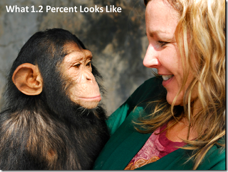
It occurred to me that instead of showing a 34 percent difference, we could make the point more powerfully if we showed a much smaller percentage difference—but one that showed how even small differences could be vast. Here’s the replacement slide we came up with:
Here’s the narrative we came up with as he showed the slide:
“No one would confuse a chimpanzee with a human. They look different, they’re furry, and they’re notably smaller than human beings. But despite those marked differences, we share a surprising 98.8 percent of DNA.
Think about that for a moment. Just 1.2 percent separates humans from chimps. If there’s such a vast difference with just 1.2 percent separating us, imagine what it would look like if there was a 34 percent difference separating us.
That’s what we have here in this room. The difference between top performers and underperformers isn’t the difference between a human and a chimp. No, it’s much, much larger than that. It’s a 34 percent difference.
For the sake of our company’s competitiveness, we must commit ourselves to closing that gap tonight. I’m going to share with you our plan to help you do that.”
My takeaway from this example is that sometimes, we all think a bit too literally. If we’re trying to create a visual about good and bad salespersons, we might look for an image featuring a salesperson with up or down arrows. Or we might look for something that shows a 34 percent difference, as represented by the first slide.
But by thinking less literally, we came up with an example featuring a chimpanzee. That’s far more unexpected—and therefore sticky—than a couple of baseball players many people have never heard of.
Don’t miss a thing! Click here to instantly join our mailing list, and we’ll email you the 25 most essential public speaking tips.


Excellent point and example.
What are you thoughts on “embedding” videos into a PowerPoint presentation?
Thanks,
Phil,
Thanks for your nice words!
If you’re going to show video during your presentation, it’s often best to download it and embed the video into the PowerPoint itself. That prevents you from having to toggle between programs, and it also prevents you from having to depend on a functioning Internet connection. One caution: test all of your PowerPoint slides in “presentation” mode before presenting to make sure your videos play as desired and start when you want them to.
Does that help?
Thanks!
Brad