Public Speaking: An Oversight That Stings
A few years ago, a Reddit user posted the following photo of a wood pile. In a Where’s Waldo-like challenge, readers were asked to spot a sleeping and spectacularly camouflaged cat.

If you’re having a tough time detecting the cat, you’re not alone. Before scrolling down, take a few more moments to try to spot the tired tabby.
Give up? Here’s the answer.

Once you spot the cat, you can’t unsee it. Suddenly, the hidden becomes prominent, drawing your eye even without conscious effort.
In my role as a facilitator of Throughline’s public speaking workshops, I’ve seen an issue arise hundreds of times that I can no longer unsee – and it’s not as simple as a reclining feline. It’s an issue that’s hidden to many of our clients until the moment it’s pointed out to them – and then they can’t unsee it, either.
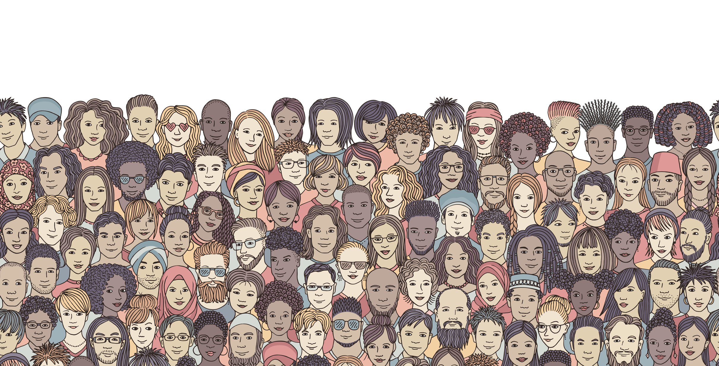
In PowerPoint presentation after PowerPoint presentation, far too many of the faces look the same – slide after slide. What I’m seeing is unintentional exclusion via photo selection.
Too often, the photos presenters select to accompany their key points reveal a lack of diversity. Unconscious biases – about race, gender, age, and other demographic factors – are undoubtedly playing into this picture. For example, if we automatically associate a well-dressed silver-haired white man with the term “business executive,” our photo selection may follow suit.
Now, imagine you’re a member of a group that has a history of being excluded (or, perhaps, you are a member of such a group). The speaker has loaded their slides with images that look nothing like you and, worse, seems oblivious to the fact that other types of people exist at all. At best, the speaker missed an opportunity to connect with you. At worst, the speaker might have lost you – and anyone else in the audience who is sensitive to such issues – for good.
I don’t profess to have the perfect answer to this problem, but I can share how I’ve addressed it.

I try to be mindful. It’s not practical or necessary to try to insert every ethnic/racial/demographic group into your slides; doing so could even backfire if it’s perceived as inauthentic. But it is important to send a signal to your audience that you recognize that not everyone looks the same, and that you have selected your images accordingly. Similarly, avoid typecasting – societal and professional roles should not be portrayed with one particular look. The boss shouldn’t always be a man, for example, and the employee shouldn’t always be a woman.
This lack of diversity may, in part, be an issue of source material. I’ve found stock photo houses to be unpredictable. Some searches yield a broad cross-sample of people; others look rather homogeneous. If you’re struggling to find the right photos, this Huffington Post article offers several good websites that feature diverse stock imagery.
The effort is worth it. Once you see what was previously unseen – whether a cat on a wood pile or the numbing sameness of people on slides – it’s difficult to unsee it.
Assume your audiences see it, too.
We’d like to learn from you on this topic and welcome your comments and experiences on Twitter (@Throughliners) and Facebook.
Cat wood pile photo credit: Reddit user waterhauler


