The Perfect Point At Which Speaker And PowerPoint Meet
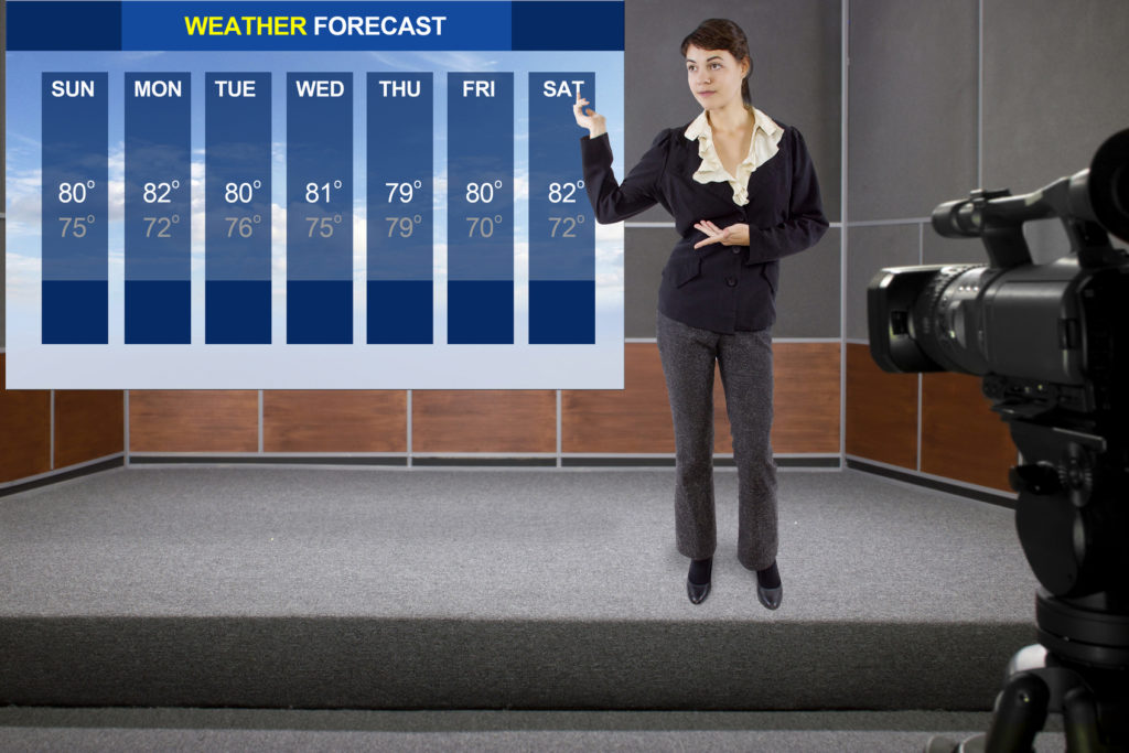
Think back to the last time you saw a television meteorologist reporting on a severe storm. If the report followed its most common form, here’s how it probably played out:
The news anchor tossed to the weather reporter, who was sitting at a desk or standing in front of a green screen; the weather reporter, appearing on camera, started to describe the weather event; graphics or video of the storm dissolved onto the screen while the reporter continued speaking in voiceover; the graphics or video dissolved back to the weather reporter on camera at the conclusion of the segment.
All of those things probably occurred so seamlessly that you weren’t consciously aware of the transitions between the component parts.
That is the perfect point at which speaker and PowerPoint meet, when the two are so synchronous that you barely notice the transitions between the two.
But when speakers interact with PowerPoint as they typically do—by progressing through their decks in a “Click / Talk; Click / Talk; Click / Talk” format—they call attention to the transitions. (I wrote about a good way to break the “Click / Talk” format with a technique called “You lead the slides; don’t let the slides lead you.”)
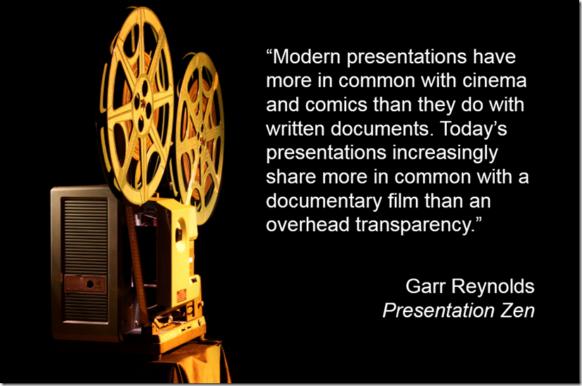
Garr Reynolds, the author of Presentation Zen, draws a similar analogy about the proper role of PowerPoint—but rather than compare modern presentations to a television weather report, he cites documentaries.
Presenting slides in a synchronous manner by making sure they flow seamlessly with your narrative is half of the equation. The other half is that the visuals must be designed to make your point in the most efficient manner possible.
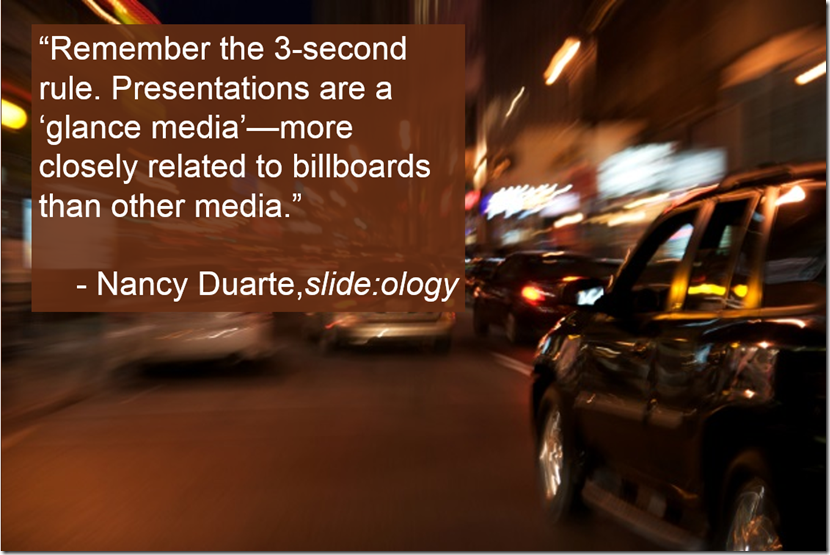
Nancy Duarte, author of slide:ology, argues that slides should be so spare as to communicate their meanings within three seconds.
A Good Example of Presenter and PowerPoint
In this speech about climate change given at Davos in 2015, former Vice President Al Gore offers a good example of the synchronous marriage between presenter and PowerPoint.
If you begin watching this clip from about the 4:00 mark, you’ll see how Gore’s talk comes across much more like television meteorology or documentary film than the standard “Click / Talk” presentation.
(It’s true that Gore has given this talk many times, making it easier for him to remember his presentation’s sequence than the typical presenter. Here’s a tool that will make remembering the sequence easier for you.)

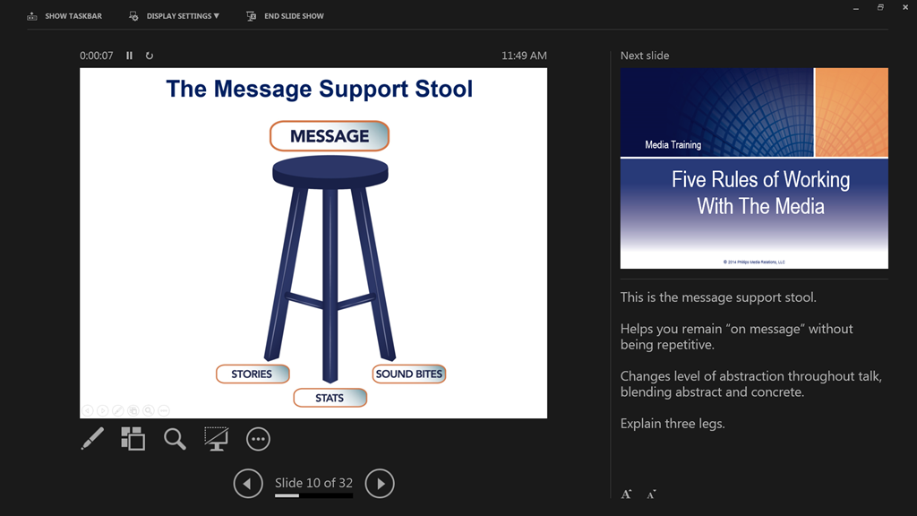
Great points Brad. I strongly agree with the “3-second rule”, which I interpret as having no more than about 15 words per slide (and preferably less), by using charts, diagrams and photos.
I even like to extend the seamless flow of visuals to the Q&A part of a talk, with a ground-breaking technique I call “Stop Q&A hypnosis”. (Would be delighted to hear your thoughts on it.)
P.S. By the way, when embedding a YouTube clip in a blog post, you can set a start and end point if you want to. So to have the clip start playing at 4:00 automatically, just add &start=240 to the end of the video’s URL. To have the clip end at (say) 5:00, add &end=300.