What Public Speaking May Look Like In 10 Years
Let’s say you have to present a detailed financial report to your company’s board of directors. If you’re like most presenters, you’ll prepare a PowerPoint deck complete with charts, graphs, and key points in text form.
That’s all wrong, argues Edward Tufte, a Yale professor best known for his landmark book The Visual Display of Quantitative Information. (I attended one of his full-day seminars in New York City earlier this month.)
The problem is that PowerPoint is hierarchical—one slide follows the next—and not “flat.” As a result, audience members are forced to listen to the information in the manner and order the presenter desires—which may or may not match the audience member’s preferred cognitive style.
The solution, according to Tufte? “We should break out of the hierarchical one slide at a time system and be flat.”
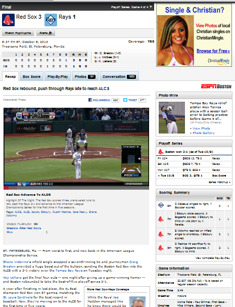
To make his point, Tufte displayed a news story from ESPN.com about a baseball game. The article was full of different types of information—blocks of text, a box score, charts with player statistics, an inning-by-inning timeline, a call-out quote box, and links to additional information—all presented on a single “flat” page.
But even with that apparent deluge of information, Tufte argues people can easily make sense of it, as evidenced by the millions of people who navigate the site with ease each month. And each person has the advantage of navigating the site with his or her own preferred cognitive style.
In practical terms, here’s what he’s suggesting.
If you’re presenting complex information, prepare a handout for your audience. When your presentation begins, hand the printout to each person, tell them you’re going to begin with a “study hall,” and direct them to read the document.
Or, you may prefer a more advanced version of that technique–something Tufte sees becoming much more common in the near future. Soon, he theorizes, it may become common practice to provide everyone with an iPad (or similar device) on which your “flat,” multi-media report is preloaded for their perusal. They’ll navigate the iPad report themselves, but while seated in the meeting room during the allotted meeting time. He calls this a “high resolution information transfer from your report to the audience.”
Only once you’ve given everyone sufficient time to complete their review of your document or iPad report would verbally expand upon the meaning of the document’s key points–without repeating them verbatim. Finally, you would end with a brief Q&A session.
Tufte argues that this “Read-Listen-Question” format would make most business meetings 20 percent shorter. Amazon.com, among other companies, has instituted this format for many of its internal meetings.
I like his idea, and it’s worth adding this structure to your list of possible presentation formats. But this format clearly has more of a place during an occasional internal business meeting than a persuasive speech; more of a place during data-heavy scientific or financial briefings than presentations to potential clients. I’d also stay away from this format if you’re trying to lead the group to a powerful “a ha!” moment.
What do you think? Please leave your thoughts in the comments section below. (Photo credit: Aaron Fulkerson)
Want more free public speaking tips? Check out our 25 Most Essential Public Speaking Tips!


I’d be interested in hearing more about this, because it strikes me as being somewhat counterintuitive. One of the things I remember about my public speaking training is that giving handouts to the audience before the preso was verboten; you didn’t want them focusing on the handouts instead of what you had to say. Example: when pitching our CEO on a particularly expensive PR program that we felt was worth the investment, he took our hard-copy presentation, jumped right to the end to see the cost, and immediately shut us down. We had no opportunity to prime him on what we saw as the value of the expenditure. Perhaps this is what you call the “a-ha” moment in your comments above, and in which case we shouldn’t have given him the number right away. However, I question how this presentation approach is different from sending the preso out as an e-mail. The value of giving a good presentation is your speaking skill, not what is in the presentation. Granted, Dr. Tufte is talking about sharing a lot of data, but I think even in that case there’s value in guiding the conversation rather than leaving others to their own devices. Nonetheless, something definitely worth looking into. Thanks for sharing!
Hi Art,
Thank you for your comment and for your smart caution about this technique. I agree with you — that’s a time you definitely would not want your CEO to read ahead!
My thought is that Dr. Tufte’s idea has limited but useful application. For example, imagine you’re an employee tasked with reporting to upper management. In order to begin your report, you all need to be aware of the latest data from the latest reports. Assuming advocacy or “moving minds” isn’t part of your agenda, I can see how Tufte’s plan could work well in such a setting. Begin with the “study hall” — and then, when everyone is “on the same page,” you could move on to the verbal portion of your presentation.
I’m pretty sure this wouldn’t be a best practice for most presentations, but I can see how it could be useful for some.
Thanks for reading!
Brad
This is good stuff! The main point I took away — really think about the objective of your appearance and be flexible/innovative in how you present in order to be the most effective. I suspect the approach taken above can lead to a discussion that jumps around the room, but it will be a discussion! And if that’s your objective, bravo!